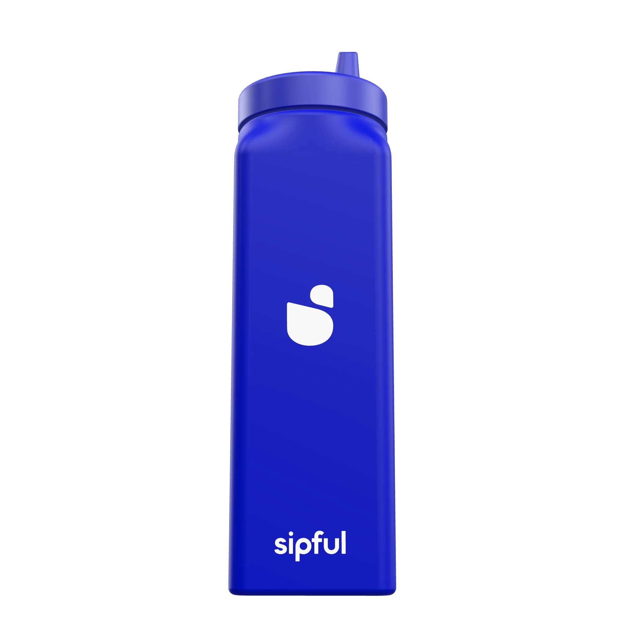
3D geometry by Lenes Lopez Gonzalez · used with permission
Product design · 2023–2025
a sippy cup for adults who need one
My partner Lenes Lopez Gonzalez and I took this from a sketch to four CAD revisions, two physical prototypes and tooling quotes. He did the CAD and the renders; I did the research, the brand, the manufacturer and the money. A tariff stopped it before the molds were cut. It is the only work I have that went all the way to the edge of manufacture, and the only reason it is not on a shelf is a number nobody in the project controlled.
01 · The problem
the object works and it costs you something to hold
I worked as a caregiver in a nursing home. An adult who cannot drink from an open cup gets handed a children's product, and it looks like a children's product. It does the job, and it announces something about the person holding it to everyone in the room.
A patient asked me to help her find a better cup. She gave me three requirements: it had to be a sippy cup, it had to be big, and it had to look pretty. That third one is the whole design brief, and it is the one nobody had bothered with.
So the brief was narrow and it was not really about the spill. I wanted a cup that worked the same way and read as an adult object, so the valve had to disappear into the design rather than sit on top of it.
02 · The design
four revisions, and the valve set the rest
Lenes modeled it in Rhino 7, through four revisions, with STEP files for the bottle and the lid. I set the brief and reviewed every revision against it. The revisions got specific: the last one added a fillet to the inside edge of the sippy part and matched it to the fillets on the grip indents, because a hard inside edge is where a mouth notices a cup is medical.
03 · The brand
the icon is two shapes, and it stands without the word
I made the brand: the icon, the wordmark, and a third lockup with the spacing already set for the curve of the bottle. The icon is two shapes, a cup and a drop on its shoulder. It is also the mark on its own, with no name beside it.


Two directions that did not survive


Neither of them is the one I kept.
04 · Prototypes
two prototypes, in my hands
I worked with a manufacturer through two physical prototypes and reviewed the second one with them in person in April 2025. Holding a revision is not the same as turning it on a screen, and both prototypes changed the file afterwards.
I also looked into in-mold labeling, so the wordmark would be part of the bottle instead of a sticker that peels in a dishwasher. The manufacturer gave me a straight answer: the process is real, and it only pays for its robotics on a run that never stops. That is the kind of thing you find out by asking rather than by reading.
05 · The launch decision
i built the kickstarter budget and then refused to use it
Kickstarter is where a product like this is supposed to launch, and I had the budget built by June 2024. Then the contradiction got hard to ignore: the people this cup is for are the least likely to navigate a crowdfunding platform, so a caregiver or a family member would be doing the buying for them.
We were designing a product to give someone their independence back, and a purchase that took it away again. So we moved the campaign onto our own Shopify storefront with Crowdfunder instead: a checkout people already recognize, our own accessibility decisions to make, and the same site still standing after the campaign ends.
What it taught me: the obvious platform was the wrong one for exactly the reason the product exists. Our buyers were not the average case.
06 · What stopped it
a 145% tariff on the molds
The tooling was quoted in China. A 145% tariff landed on those molds, and the number that the whole plan rested on stopped being the number. I spent months on alternative manufacturing and the project stopped where it is: four revisions, two prototypes, a Kickstarter budget, and no tooling.
- 4CAD revisions
- 2physical prototypes
- 145%tariff on the molds
07 · What it taught me
the constraint that ends a project is usually outside it
I can take an idea to the point where a factory quotes it. The design was never the risk. The risk sat in a supply chain I had no say over, and I didn’t go looking for that number until it had already moved.
I left film to work on this. That is the decision I would make again.